So, Günter J. Hitsch, Ali Hortaçsu, and Dan Ariely have a paper that empirically analyzes correlations between posted characteristics and success rates in online dating. A lot of you have probably seen this already, because UC Berkeley economist Hal Varian had a little writeup in the Times about a year ago, but I ran across it recently somehow (blog post, perhaps? Lost in the foggy mists of my browser's history...).
Anyway, as Varian suggests, it's mostly an exercise in confirming common sense, but not entirely. Of course, it is actually valuable to have your common sense examined empirically once in a while, so I heartily encourage you to skim the paper's results yourself, but I'm going to pull out a few results that aren't entirely obvious from (my) common sense.
First, here's Hitsch et al.'s chart correlating body mass index (BMI) for men (left) and women (right) with response rate.
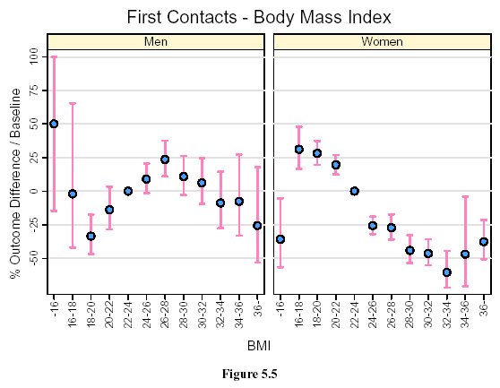
It's no surprise that women benefit more from being thinner, but I think it's really interesting that the response rate peaks at such an extremely low BMI. The authors report that the peak BMI is about 17, which corresponds to an underweight, "supermodel" figure. It is, of course, commonplace for feminists to remark that American society has unrealistically thin body expectations for women. A lot of men believe that this is an expectation perpetuated mostly by women's fashion magazines. Whenever you bring up the body image issue, online or off-, some man will say something like: "Well, I don't prefer stick-thin women. Slim, yes, but not bony like a fashion model." I mean, I'm a man who believes something like that. Yet I look at the chart above and I wonder.
Now, the caveats. First, it's possible that the results arise from men's misunderstanding how a numeric weight translates to an actual feminine figure. After all, the men are only reading a number, not looking at bodies (I'm assuming the profile photo's usually a head shot, rather than a full-length bikini beach photo). For example, I weigh about 155 lbs, and I assume that a slender woman my height would weigh somewhat less, but I'm not really sure whether 135 lbs would be emaciated or merely thin. Second, the economists find that women are probably lowballing their self-reported weight: "Among women, we find that the average stated weight is less than the average weight in the U.S. population. The discrepancy is about 6 lbs among 20-29 year olds, 18 lbs among 30-39 year olds, and 20 lbs among 40-49 year olds." --- so either the personals users are exceptionally fit, or they're lying. Men might know this, and compensate by mentally adding a few pounds to whatever the profile reads, hence their preference for exceptionally low (reported) BMI.
However, in spite of these caveats, I think the evidence suggests that the ideal towards which so many women strive is, to some extent, a rational judgment about men's aggregate weight preferences. It's true that people can be attracted to potential partners who don't attain that ideal. But that doesn't mean that more people wouldn't be more attracted, on average, to someone who's closer to that ideal.
OK, enough with the weight. Let's look at the ethnicity findings. In my opinion, these are the most interesting findings in the paper. Money, education, looks, weight, age? Everybody basically agrees and accepts that people discriminate based on these factors; they reflect differences in character, in lifestyle, or in plain sex appeal. But race and ethnicity are stickier issues. It's not clear whether it's really acceptable in polite society to admit that, given a choice between a good-looking white man and an equally good-looking black man, with the exact same job and income, you would really prefer to date the white man. Is that a form of racism, or not? Is that the same as men preferring blondes (an actual finding that, incidentally, also emerges in the study), or is it something different?
Anyway, here's Hitsch et al. 5-10:
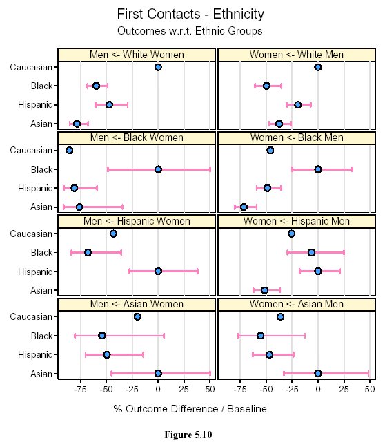
This figure requires a bit of explanation. The charts on the left indicate who women emailed, and the charts on the right indicate who men emailed. These are so-called "first contact" emails, meaning that these are the preferences of initiators, not responders. (This is a pretty big source of asymmetry, since men are usually initiators. In fact, 54.5% of men received zero first contacts. For men, it would be more interesting to track "first responses" to emails sent.) The labels on the vertical axis indicate the ethnicity of the person emailed. For each of the four ethnicities --- white, black, Hispanic, and Asian --- the rate at which the emailer emails his/her own ethnicity is considered the baseline rate. The labels on the horizontal axis describe how much less (or more) probable each ethnicity is to receive a first contact email, compared to the baseline. (I assume the pink bars are confidence intervals.)
So, what's the result? All men and women of all ethnicities prefer their own ethnicity. That's straightforward enough and can be explained by basic homophily or whatever, although the strength of the preference is pretty startling to me: most groups have at least a roughly 1/4 disadvantage relative to baseline, and often more. I guess I'm naïve, but I would have hoped for closer to 5% than to 50%.
More interesting than the strength of the preference, however, are the differences among the groups. Some of the confidence intervals run pretty wide, so some individual charts have to be taken with a big grain of salt, but you can still see broad trends. For example, women across the board have much stronger ethnic preferences (or biases, if you like) than men. Also, Asian men and women alike seem to prefer whites significantly to any other non-Asian ethnic group, but whites do not return the preference, ranking Asians last or next-to-last. In fact, Asian men do pretty badly overall, coming in no better than a 75% diminished preference by any other ethnic group (and apparently getting zero emails from Hispanic women). Finally, based on my completely unscientific eyeballing of the charts, for whites and Asians, men and women seem to have preference profiles with similar "shapes" --- that is, the women's ethnic preferences are stronger, but their relative preferences are similar to men's --- but for blacks and Hispanics the men and women seem to diverge.
But even more interesting than any of that is Fig. 5-11:

This is the difference between (white) people who admit they have ethnic preferences, and those who claim that they don't. Note my verbs, because although there's a statistical difference, the curves have the same similar shapes (UPDATE: see comments), and the ethnic preference remains strong in the latter group --- greater than 50% for women, and in the ballpark of 15-50% for men.
I think that chart almost speaks for itself, so I'll keep my remarks brief. Is this caused by unconscious bias? Perhaps. Or maybe it's like lying about your weight. I know that if I saw that a woman's profile had an ethnic preference --- any preference, even for my own ethnicity --- I probably wouldn't want to email her. By not listing a preference, one signals one's open-mindedness.
Finally, to end on a lighter note, here's Fig. 5-7, the result that's probably most relevant to the people who read this blog --- educational attainment and response rates:

Look at the highest data point in first contacts for men. That's right guys, chicks dig grad students.
Well, OK, back to reality. Clearly, the "in post-graduate program" results for men are a fluke arising from the fact that the category lumps together professional students with Ph.D. grad students. Law, medicine, and business students are training for lucrative careers as highly esteemed members of society. Ph.D. grad students are training to be credentialed professional nerds. As much as I wish that most women found the latter attractive, I have to admit that it is, shall we say, a distinctly minority taste.
Regarding Fig. 5-11, there seems to me to be a pretty dramatic difference between the southwest and southeast charts; the Asian number moves a lot. I have trouble making sense of this and the preceding chart despite your clear explanation, so I can't glean any meaning from the discrepancy - but I don't think it's quite right to say that the curves have the same shape.
ReplyDeleteAh, you're right. The Asian data point moves a lot between those two charts. What this means is that (white) men who claim an ethnic preference are 75% less likely to email an Asian woman than a white woman, whereas those who do not claim a preference are (eyeballing here) only about 30% less likely.
ReplyDeleteIn general, men who claim no ethnic preference are the least biased of the four groups. Compared to men who claim a preference, the difference in their contact rates for black women seems to be negligible; their preference for Hispanic women moves by about 20 precentage points; and their preference for Asian women moves by about 45 percentage points. So the shape changes somewhat. These are, again, all eyeball figures. It looks to me like the average diminished preference is still over 25% though, which strikes me as large.
Thanks for the explanation; that's even more interesting. Maybe (some) white men use a willingness to date Asian women as a way to "prove" (to themselves or others) that they're not racist. A way to "cross the barrier" without really confronting their racism. Call me a cynic.
ReplyDeleteYou didn't comment on fact that in figure 5.7 (education), the men's and women's curves are almost mirror images of each other. Women prefer men with education (up to a certin level), whereas men prefer women with less education. What explains this? Are men intimidated by educated women, or women who may earn more than them? Are women looking for men with high incomes?
ReplyDeleteI wonder why the tails of these graphs (masters, Phd, and professional degree) reverse the trend. Perhaps it's because people at these levels are older, and you're running up against our society's youth preference.
Results for same sex couples would be interesting to see too.